
A Fashion Designer’s Hot Take on the 2026 Pantone Color of the Year
Before I was a fashion and live event illustrator, I spent years in art school, learning form, composition, and yes, in-depth color theory. So you better believe that when the 2026 Pantone Color of the Year was announced, I had thoughts. Many thoughts. Many strong thoughts. If you’re ready for a no-punches-pulled review of the color of the year, keep reading; it’s going to get spicy.
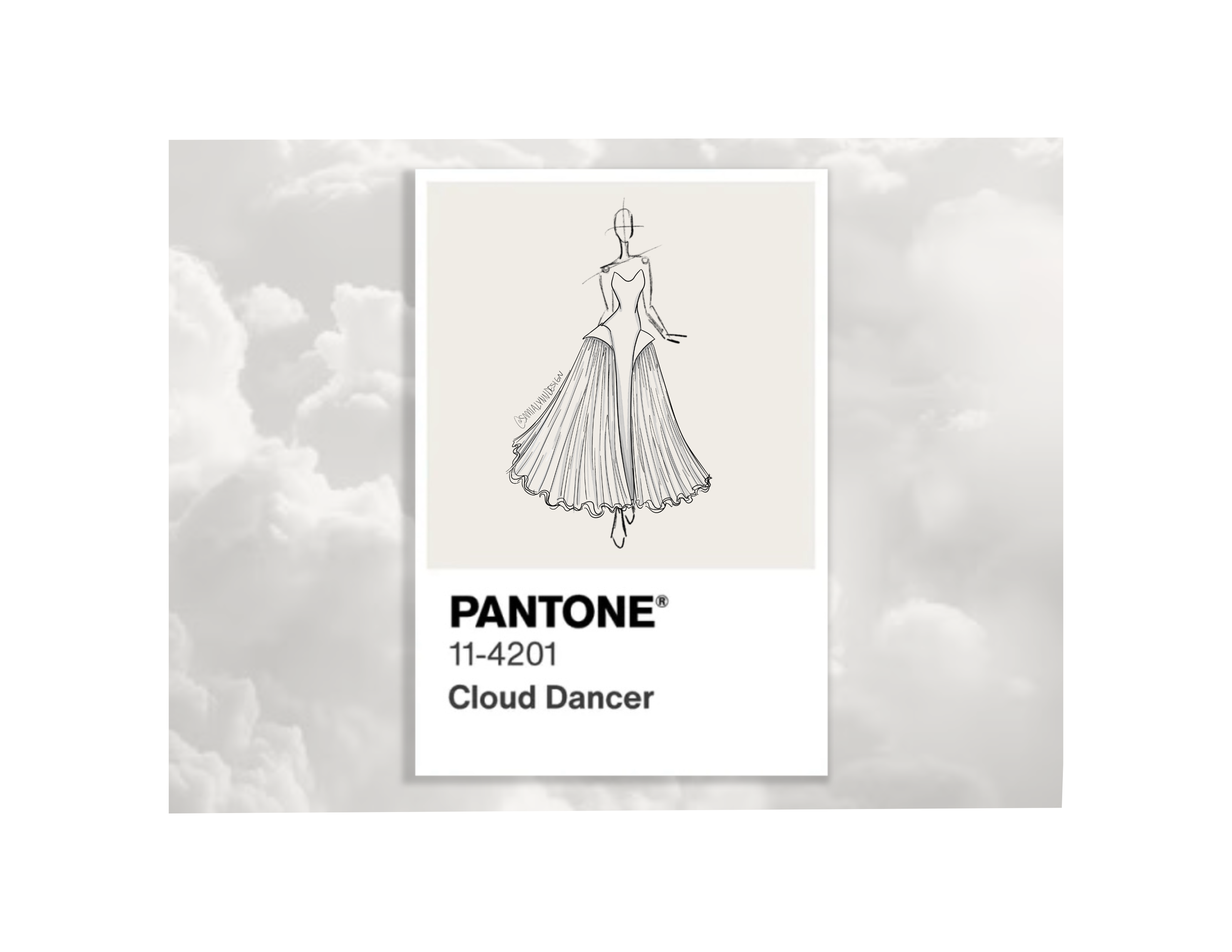
Cloud Dancer: The 2026 Pantone Color of the Year
Pantone’s color of the year for 2026 is Cloud Dancer, a soft, creamy white that, according to Pantone, “serves as a symbol of calming influence in a society rediscovering the value of quiet reflection.” But it’s still… white.
The Cultural Issue
While there’s nothing wrong with the color itself, Pantone’s choice to promote white as the color of the year during a time of so much political unrest is tone deaf at best. In their color announcement, Pantone even states that color “has become synonymous with self-expression.” They then try to make the point that Cloud Dancer is a color of harmony.
On the contrary, I think it represents conformity.
Pantone began choosing the color of the year in 1999 to draw attention to the relationship between color and culture. Seriously, read it for yourself: “We wanted to draw attention to the relationship between culture and color. We wanted to highlight to our audience how what is taking place in our global culture is expressed and reflected through the language of color,” said Laurie Pressman, Vice President of the Pantone Color Institute
This is all before we get into the technical issue of the color itself.
The Technical Issue
Besides the obvious societal and cultural implications of making white the 2026 color of the year, there is one very basic, fundamental issue with Cloud Dancer.
WHITE IS NOT A COLOR.
As an art school graduate, I will die on this hill. White is not a color itself; it is the absence of color. Cloud Dancer technically shouldn’t even be in the running, let alone chosen as the Color of the Year. This is also the second consecutive year that Pantone has chosen a neutral, and frankly, it’s getting boring.
What I Would Have Chosen Instead
WGSN, one of the utmost authorities on trend forecasting, chose Transformative Teal as their color of the year. Driven by their prediction of a call for ecological responsibility, Transformative Teal is a smooth, luscious blend of aquatic blues and greens, hinting at the diverse colors found in nature.
This teal is eye-catching without feeling demanding. It invites a soft yet strong presence to any color palette. As a lover of bold colors, I can already imagine dozens of gorgeous color combinations using this color, and each of them feels fresh and exciting. If you’re looking for an interesting color that will subvert expectations, I highly recommend checking out WGSN’s color of the year and considering the related palettes!
Your On-Call Event Artist
I know this blog is a departure from my usual, but I simply couldn’t pass up an opportunity to talk about the underlying messages behind the colors we use. But don’t worry, I won’t blame you if you incorporate Cloud Dancer in your wedding theme! It’s a beautiful hue that, admittedly, blends flawlessly with many palettes.
My only request? You choose the palette you want, not just what the “experts” say is trending.
At the end of the day, your wedding is for you and your partner. Pick the colors that you love, the ones that make you happy! And then celebrate your wedding with custom artwork and live illustrations for your guests. Live illustrations are the perfect keepsake for the day you always want to remember. Contact me to learn more about this interactive guest experience and secure your date!
Sources:
Pantone’s Color of the Year Announcement
An Interview with Laurie Pressman, Vice President of the Pantone Color Institute
